A right proper gander
How to turn a photo into a grungy mock propaganda poster
- Apps needed: Photoshop and Illustrator
- Download the AI file
This tutorial comes by request from the Mr Craig himself in the picture and is more of a general how-to than an actual blow by blow account. I will endevour to explain as much as possible but as I tend to make things up as I go along, the chances are it may not be as clear as possible. To save time I'm running on the theory that the people who read this are slightly aware of most of the basics in Photoshop and Illustrator like layers and the tools but if you have any questions then feel free to contact me either through the contact page or on my blog. I will add more info to the tutorial as needed. Ta ever much so...

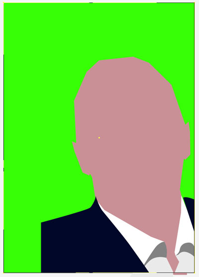
Ain't he puuuurty?
Step one
First things first, I tend to block things out on either paper or in photoshop so I can work out some form of composition. It tends to get changed a lot as I work but then doesn't everyones? Starting up a new PS file in A4, i then drop in the reference picture and place, scale, twist etc... until I'm happy with the position.


Step two
I will start to mess around with text, basic colours, shape and form to try and get the layout I am after before I get too bored with not getting on with the nitty gritty. Once I'm happy with the placement I will setup a document which is the same size in Illustrator.

Switching back to photoshop I then select the whole of the layer with the photo, and copy that layer only. Going back to Illustrator I will then paste the layer onto the artboard.
Step three
Lock the layer as we don't want to start sketching all over that and make a new layer above

Step four
Now we start to do the fun bit! Using the pen tool (p) its time to trace out our outline. I use a bright coloured stroke with no fill. Lost you? The fill and stroke are the two little box bits near the bottom of the tool bar. Got them? Good.

Using a nice bright red allows me to see the line and the fill will just get in the way at the moment. As I want solid slabs of colour for the final illustration I don't draw out the curves of the face, just nice hard corners.
Step five
Time to reflect on what we have done so far. As I am lazy (but it can be useful at times) I just copied the half of the face I drew out and used reflect to flip it over. As faces are never symmetrical this can actually help to give a slightly unsettling feeling to the picture (my excuse anyway).

I move the new path to the correct place and align it with the side of the head using the Selection tool (v) then combine the two path by using the pen tool. To combine just hover over one of the open ended anchors and you should see a small / appear next to the pen. Click, then go to the other path open anchor and when you hover over it should have a small o appear. Click and the two paths will combine. Easy
Step six
Next I did the neck using a similar technique. When drawing a new path, Illustrator will automatically place it over the top path in the currently active layer so bear this in mind. It can be useful when masking out shapesand it often helps to think of things in terms of layers. Eg your clothes go over your body (I hope) so the layer for clothes would go over a skin layer.

Step seven
After blocking out the head and neck its time to move on to other parts.

Here I've started to draw out the collar and shirt. The collar is two white pieces (one left, one right) with a light grey path underneath to make the shadow then another path to make the shirt. I've also set a colour to the fill part of the face to make sure its starting to look ok. I tend to block out colours early and change them as I go along. I've also added some curves to the shirt as I made it to soften the shape.
Step eight
After a while I drop in a nasty bright colour as a new layer underneath to see if there are any gaps. Switching this on and off while working helps get away from looking at the photo. I've also started to draw the jacket.

See that? You can't see it with the black beckground photo
Step nine
By adding, pushing and moving the anchor points around its getting to a point I can start to see it all coming together. I start to make up content such as the way the jacket falls off the left side of the page as the photo was cropped at that point.

Mid way check point time. Part of whats hard about writing a tutorial like this is that I tend to experiment a lot as I go along so most of this is pretty vague but hopefully you can see the flow of building up the image. Identify a part of the picture, trace it, make sure its above or below the other paths so its in a logical order and then wash, rince and repeat. Following this methodology we get to do the hair.

By switching the green shape and the head path on and off in the layers window, I traced the shape of the hair...

...then added some highlights to make it something more than a simple flat colour. At this point I know I want to keep the final image as simple in detail as possible so didn't go mad on the hair but as our subjects has somewhat wild and wooly hair I added some chaos and spikes flowing down. This is a good point to know about the handles and anchors which make up the pen tool in illustrator. I'm not going to spell them out as there are better places to find out about them (RTFM for one) but the curves and flow of the hair is one of the parts I used them the most on.

Step ten
The glasses. Thank gaaawwd for glasses as I hate drawing eyes. by adding the white part of glasses I can add a layer of mystery to the image and I don't think it would have the same impact with the eyes. That pair of white slabs in the middle of the picture makes you look right at that point of the picture and its almost like the subject is looking out at you but you can't see him. Oooooooo suspencyiousness.
To add the glasses I just traced the inner and outer paths of one side of the glasses.

By having the two paths selected I use the pathfinder tool to knockout the hole in the middle


The second one along on the top row is the minus front option and this will slice out the shape of the path above the path below. this gives us the frame under which we can place a white lens shape. Why cut out the shape and not just place a white path above a black one? No reason not to except I want to add some more detail to the lens later and figured it would work better if the frame masked off the edges of the lens below.

The glasses path is duplicated along with the newly formed white lens, reflected (object>transform>reflect and then vertical) and lastly, moved into place so the pathfinder can be used to weld the two halves together (the unite tool on the pathfinder box). A bit of tweeking was needed to get the shape around the arm of the glasses to fit but once I got it in place it was time to move onto...
Step eleven
Time to start on the shading and final colours. I settled on the colours by working through a range of colours I have used before and used a skin tone similar to one of my earlier posters. To simplyfy the shading (did I mention that I'm lazy?) I copied the path with the face outline by dragging the path onto the 'create new layer' icon at the bottom of the layers. The difference between using that and the simple 'copy and paste' method is this way creates the new path in exactly the same spot as its original. Copy and paste drops the new content into the middle of the canvas as you are looking at it so will not be placed exactly.

Notice the nice sunburned neck which was going to be the darker skin tone before I changed it :) So now we have a duplicated path, i lock the layer below and then pick a new shadow colour for the skin and start to move the points on one side of the face to make the outline.

Using the photo as a guide I blocked out the basic outline by using zigzag shapes along the face and repeated this method with the neck. I've also added a white outline around the face by using the stroke tool with a white colour and a 4px weighted line

This closeup of the chin shows what happens when the white is added to the layer below. The layer above overlaps as they have the same size. There are several options to choose from to sort this out such as using the offset path tool to move the white path out a bit or even changing the blending mode. My favourite method is to simply move each anchor point so the top path is slightly inside the white line.

The line of the shadow is moved to follow the white exactly

The same is done for the hair and the shoulder only this time I had to delete a lot of the points on the new path because otherwise the white line would have come inside the face and all I was after was the 'ready-brek-esk outline. The hair proved to be slightly tricker due to the spikey nature and in the end I used the offset path option and then manually cleaned up the new path.
I should point out the mouth and chin which appeared in this part, both are just simple black lines and I skipped the 'tash and beard for both artistic reasons (did I mention I am lazy) but also our delightful subject doesn't normally sport such facial fungus. It was grown for charity mate...
Step ...gasp.... twelve
Nearly there. Now its just a case of final details and cleanup. The shadow around the ear on the right is added. The button on shirt is created from a simple circle. The shape of the nose is defined by adding anchor points and moving them around. The eyebrows are drawn as a path then copied and reflected. Yellow is set as the background colour. Theres a wee highlight on the nose tip. A darker shadow is created to add some more depth. Reflected highlights on the glasses and we are DONE! The outline busts out of the artboard but that wont appear when we head over to Photoshop.

Speaking of which
Step thirteen
Simply opening the file up in photoshop will bring up the options to import and set a size and things like colour mode. I tend to work in RGB after my experience working with video but don't let that stop you using whatever your preference is. The next part is to dirty up the image by dropping new layers on and adjusting the blending mode.
I've got a big stack of texture files that I've created over the years, bought, scrounged off the net or picked up from somewhere. If you have a scanner then there is nothing more fun than dirtying up paper and making your own. There is a textured layer underneath the imported illustrator image and the screen blending mode of the illustration is set to 'multiply'. This makes it appear as if the illustration is on the paper underneath. It doesn't always work with this blending mode but a simple bit of trial and error settles that. On top of these two layers is a blank layer which I will start to paint with white blotches to simulate faded areas. I used some PS grunge brushes installed (go google up some nice high res brushes) as well as some black for dirt on a new layer. The trick here is not to overuse one brush, use it once, change the size or brush, then move on. Keep the brushes random to simulate the random nature of dirt and drop the opacity levels if needed. Also erase bits using the grunge brushes to break up the shapes.
Lastly, a white border at the top of the stack to break up the shape and text. I've used a big solid font to add some amount of drama to the text.
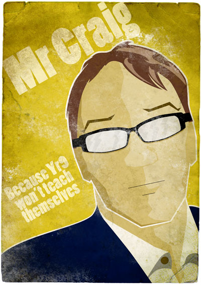
Sorry for the vagueness of the photoshop bit but its all down to messing around sometimes and more often than not something pops out through serendipity rather than design. White for faded crumpled bits and black/dark brown for the dirt.